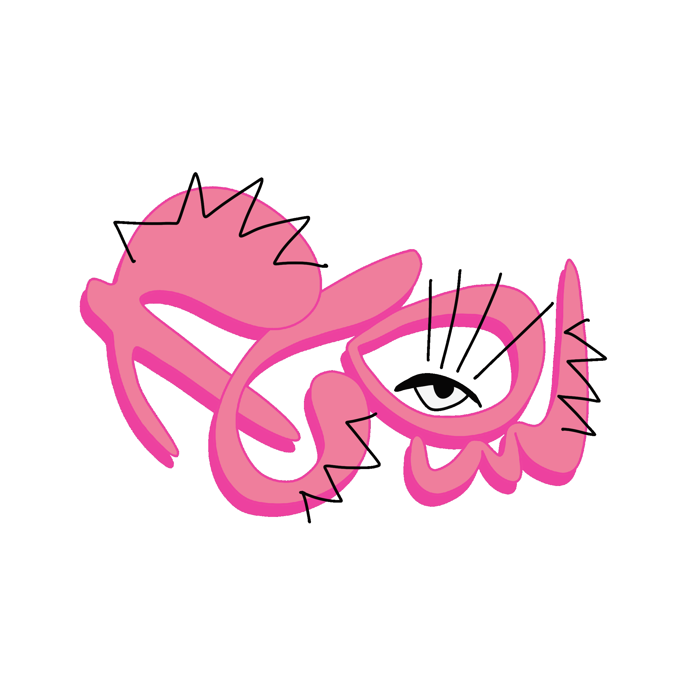
Everything. Everywhere! AllatOnce?
 |  |  |  |
|---|---|---|---|
 |  |

2023/ Analogue: 450 x 5500 mm/ Acryl on Paper
English
The work shown above, "Everything. Everywhere! AllatOnce?" is the end of a series in which I explored typography, semantics, semiotics, the connection between these "classifications" and the relevance of the latter. Originally, the idea was to use words to make clear statements that could be understood without any major obstacles; I wanted to reinforce the content of the words through the colours, shapes and composition (semantics). As the series developed, the original readability and clarity of the letters faded further and further into the background and I tried to express the content primarily through its form. Just like "normal" graphics/non-text does.
Since I started graffiti writing at the age of thirteen, letters and their play of shapes have always been present in my sketchbooks. At some point I realised that letters function as signs that carry information. However, since in other typographic works the viewer was always focussed on the content and not on the forms (e.g. „what does it say?“), I wanted to create something that clarified this type of reception (to the recipient himself/herself while receiving). This is how this work was created, sign-based overload in the artwork, symbolising the swirl and overload in my head, because of its content as well as its form.
Particularly interesting and important to mention are the places where the blue typography overlaps with the red and that this makes the non-text the most exciting form in a purely typographic work.
Deutsch
Das oben abgebildete Werk „Everything. Everywhere! AllatOnce?“ bildet das Ende einer Serie, in der ich mich mit Typographie, Semantik, Semiotik, die Verbindung dieser „Klassifikationen“ und die Relevanz dessen beschäftigt habe. Ursprünglich war der Gedanke mit Worten klare Aussagen zu treffen, welche ohne große Hürde verstanden werden können. Den Inhalt der Worte habe ich durch die Farben, Formen und Komposition (Semantik) verstärken wollen. Mit dem Weiterentwickeln der Serie ist die ursprüngliche Lesbarkeit, das Klare an den Buchstaben immer weiter in den Hintergrund gerückt und ich habe probiert den Inhalt vor allem durch seine Form zu vermitteln. So wie es „normale“ Graphik/ Nicht-Text tut.
Seit ich mit zarten dreizehn Jahren mit dem Sprühen begonnen habe, waren Buchstaben und ihr Formenspiel in meinen Skizzenbüchern immer präsent. Irgendwann wurde mir klar, dass Buchstaben als Zeichen fungieren, die Inhalte transportieren. Da aber bei anderen typografischen Arbeiten der/die Betrachter*in immer auf den Inhalt und nicht auf die Formen fokussiert war („was steht da“), wollte ich etwas schaffen, das diese Art der Rezeption (den Rezipierenden selbst beim Rezipieren) verdeutlicht. So ist dieses Werk entstanden, zeichenbasierte Überladung in dem Kunstwerks, sinnbildlich für die Wirbel und Überladung in meinem Kopf, wegen dessen Inhalts als auch Form.
Super interessant und wichtig anzumerken finde ich vor allem die Stellen, an denen sich die blaue Typographie mit der Roten überlagert und, dass damit die spannendsten Formen, in einem rein typografischen Werk, der Nicht-Text ist.